Sharpening Your Design Edge in the AI World
by Chipp Walters 4/26
Recently, I gave a talk to a group of designers about preparing for the AI era, emphasizing that design is your superpower in this new landscape.
I pointed out that while AI excels at churning out fifty beautiful designs in seconds, it falls short when it comes to selecting the truly best one—that’s where your expertise as a designer shines.
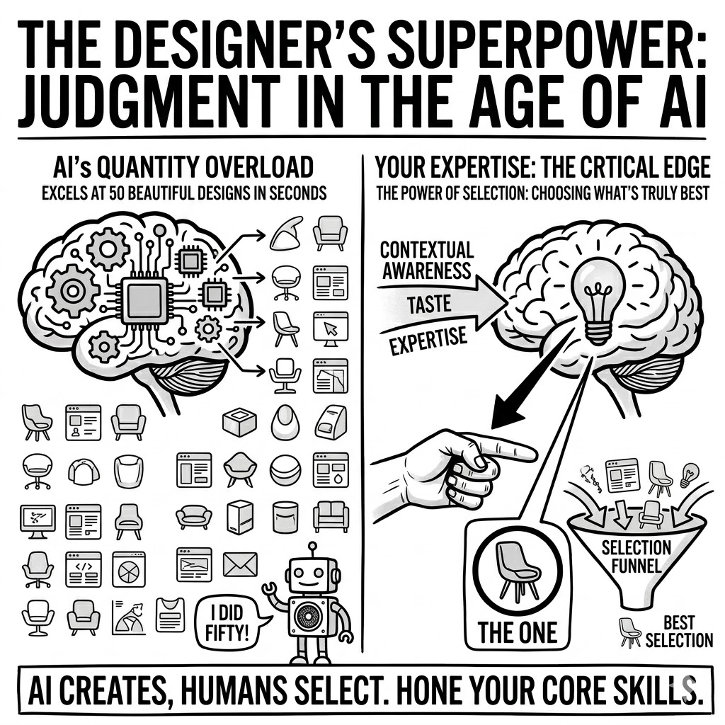
This sparked a lot of questions, leading me to advise shifting focus away from chasing the latest AI techniques and instead honing your core skills, particularly in areas where AI struggles but you’ll need them most moving forward, starting with a razor-sharp sense of aesthetics.
So, the key question is:
How do you refine that sense of aesthetics?
1. Create a Taste Library
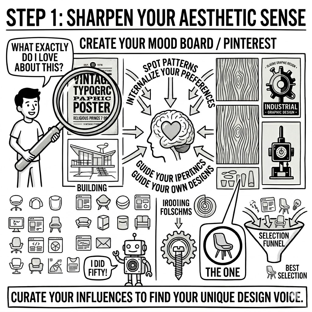
Here’s the first step:
Create a Pinterest board, mood board, or collection of designs that truly resonate with you—think inspiring images, typography, posters, products, architectural details, or graphic work—and every time you add one, pause and ask yourself:
What exactly do I love about this?
As you keep collecting, you’ll spot patterns in what resonates with you, internalizing those preferences so they naturally guide your own designs when the time comes.
2. Typography
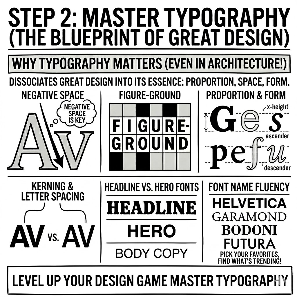
Number two is typography, a cornerstone even in design school where architects, product designers, and landscape architects all studied it because it distills the essence of great design into something simple yet profound:
- Negative space
- Figure-ground relationships
- Proportion
- Shape and silhouette
Master typography by:
- Studying kerning
- Studying letter spacing
- Understanding headline and hero fonts versus readable ones
- Picking your favorites
- Checking out what’s trending
- Getting fluent in font names and styles
3. Color Theory
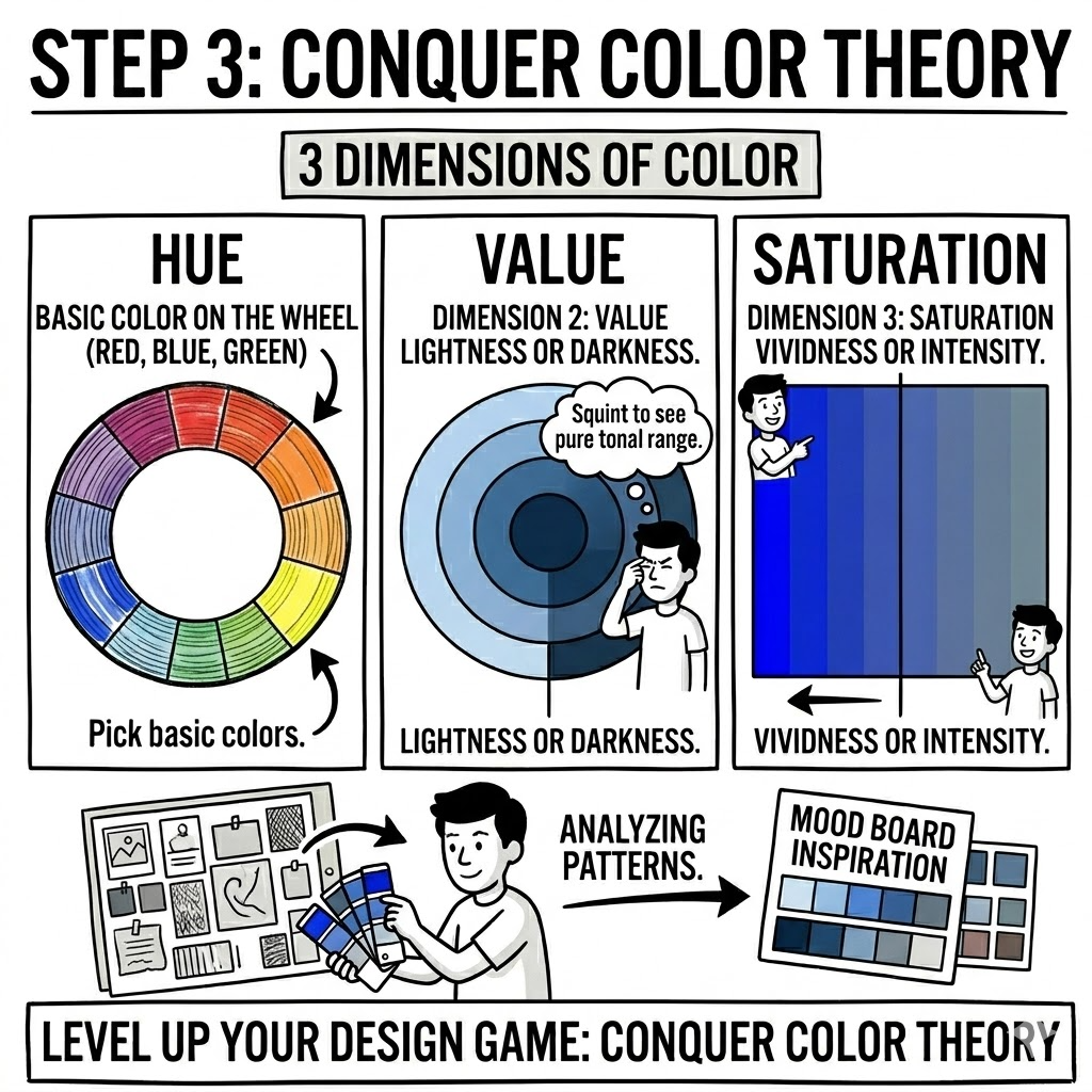
And the last is color theory, often called the strongest tool in your design arsenal, starting with its three core dimensions:
- Hue — the basic color on the wheel like red, blue, or green
- Value — its lightness or darkness, which you can gauge by squinting to strip away hue and see pure tonal range, like comparing a medium green and medium blue
-
Saturation — measures how vivid or intense the color is
- A muted blue-gray has low saturation with just a hint of blue
- A royal or cobalt blue bursts with high saturation
One practical way to apply this is by building color palettes using tools or, better yet, pulling inspiration from your Pinterest or mood boards to analyze how colors work together in designs you love.
Fix 2 and Vary 1
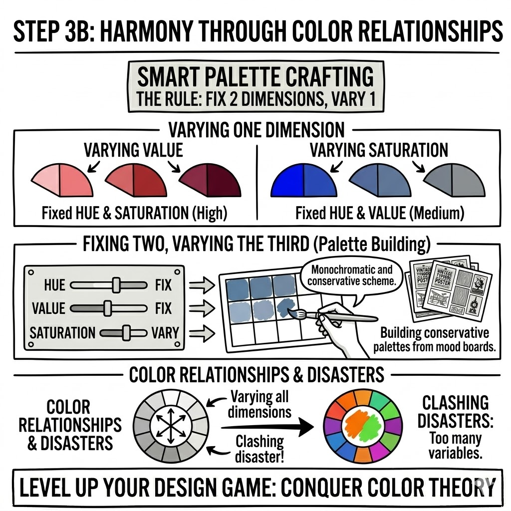
Back to the three dimensions of color, a smart way to craft palettes is fixing two and varying the third:
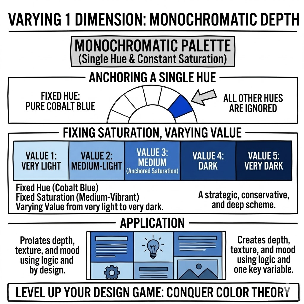
- Set hue to blue and medium saturation, then slide value from light to dark for a monochromatic, conservative scheme
- Lock medium saturation and a balanced value range across the hue spectrum for a harmonious rainbow effect
Fix 1 and Vary 2
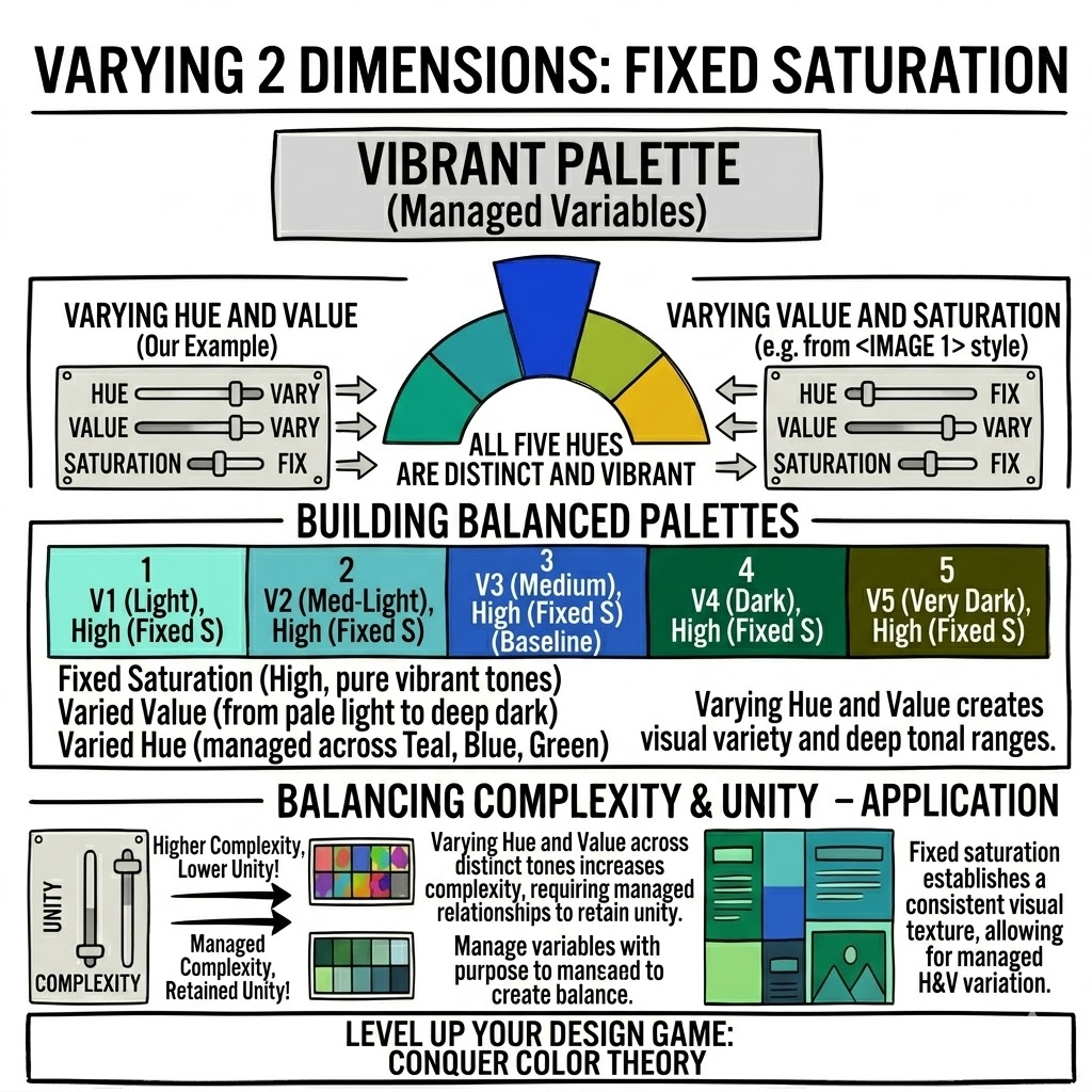
You can also fix a single dimension, like saturation in this example, and vary the other 2 dimensions to create more interest.
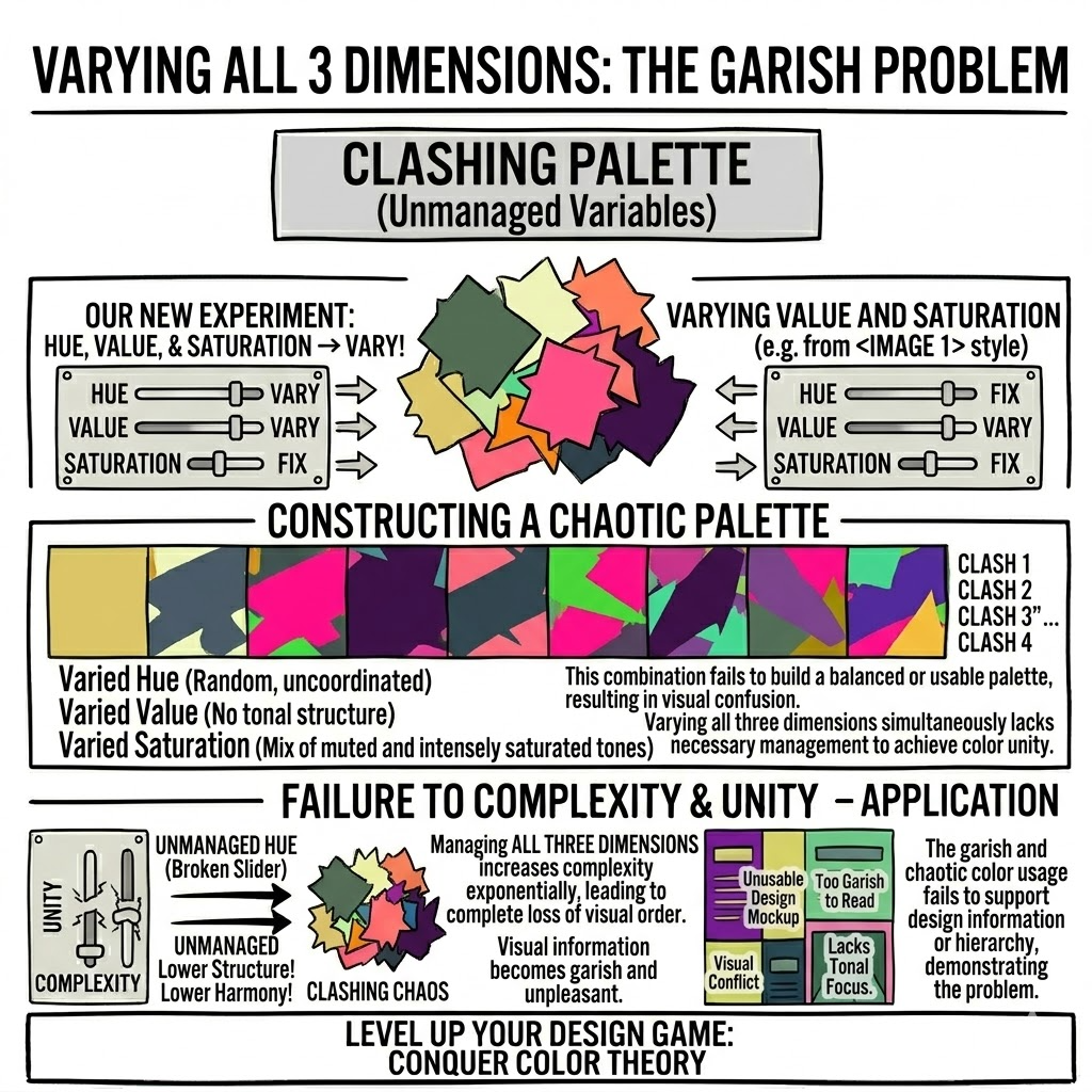
Varying all three rarely works well
Stick to tweaking just one or two dimensions to avoid clashing disasters.
Final Thought
By spending time on these—curating mood boards, mastering typography, and grasping color theory—you’ll sharpen your aesthetic sense and seriously level up your design game.