Museum For A Rainy Day: Website Design Review and Redesign
Executive summary: what this site is
In one paragraph: Museum For A Rainy Day (“MFARD”) is a free virtual art museum that you visit through an app: on iPhone and iPad, on Android phones and tablets, and in VR on Meta Quest. Each exhibition is a 3D gallery space you walk through at your own pace. museumforarainyday.com is the museum’s front door. Its jobs are to get visitors to install the app, to recruit artists to exhibit, and to start conversations with curators. The museum is made by Lenguart LLC, which describes itself as “an independent art-and-technology studio”. In the site’s words, the museum is “an independent, privately run project. It is not a non-profit, but it is mission-driven.”
Customer value proposition
In one line, as the site promises it today: a whole, curated art museum on the device you already own: free, whenever you feel like it, with no travel, tickets or crowds.
The site serves three customer groups, and each is offered something different. For each group the table separates three things:
- What the site promises: quoted from the site.
- What a first-time reader probably takes away: the panel’s judgement of how the current pages come across.
- The sharpened version: what the redesign says instead.
| Visitors (the main customers) | Artists | Curators and partners | |
|---|---|---|---|
| What the site promises | “A whole museum, wherever you are.” · “Discover their work anytime you feel like seeing art.” · “Admission free.” · “Explore each artist’s exhibition at your own pace.” (About:) a museum “without walls, travel, or crowds yet still feel curated, intentional, and human”; “Each artwork is given room to breathe … without the pressure of time or distance.” | “Imagine someone staying a little longer. With your work.” · “An exhibition of your own.” · “No exhibition fee.” · “Your work stays yours.” · “Meant to stay. Intended to remain on view.” · “We feature and promote you across our channels.” | “Let’s make something great!” (About:) special exhibitions for video, 3D and spatial work, using “technology only where it meaningfully enhances how art can be experienced.” |
| The value underneath | Access, calm and discovery. A real museum visit (curated, unhurried, spatial) with none of the cost, travel or crowds, available at any spare moment. Art by people you haven’t heard of yet. | A dignified, lasting solo show. 24 works presented together as one curated exhibition on its own floor, free, permanent, with the artist keeping their rights and getting promoted. That is the opposite of posting single images into a feed. | A new kind of venue. A place to show work that a traditional gallery can’t present well (video, 3D, spatial, photogrammetry), without building a physical space. |
| What a first-time reader probably takes away (panel’s judgement) | “A museum app, free. I’m not sure what art is in it.” The promise of access comes across. The promise of discovery doesn’t, because the art is small, cropped or missing (section 2). Nothing in the first screen says why it’s worth visiting rather than just available. | “A free, fair way to get a proper exhibition.” This is the clearest proposition on the site: the For Artists page proves it with Cristina’s floor and her 24 works. It is undercut on the homepage by the unbacked “Be seen on more screens than any other app”. | “Unclear. A contact form.” There is no explanation on the site of what a collaboration involves. |
| The sharpened version (redesign) | “A little room for art.” A free museum app where you walk through whole exhibitions by independent artists, at your own pace, on your phone, tablet or Meta Quest. Lead with a real artwork so the value is seen, not described. | “A floor of your own.” Your 24 connected images, curated as one exhibition; free to propose, no fee; your work stays yours. Show a real artist’s floor as proof, and drop the reach superlative. | “An exhibition beyond the room.” Bring work that needs space, sound or 3D; scope, rights and costs are agreed up front. |
Why it matters:
- The visitor proposition is the weakest on the page, yet it drives the main goal, installs. Today it rests on convenience (“free”, “anywhere”, “anytime”). Convenience alone doesn’t make anyone want to visit: people install a museum because a specific work or artist catches them. That is why every specialist put “lead with the art” first.
- The artist proposition is already strong. The redesign mostly brings its evidence (a real floor, the “24 works” fact, wall labels) over to the visitor pages.
- Who pays is not stated (see “How it makes money” below). How the proposition develops will depend on that answer. For example, a paid tier would need a premium promise, and sponsorship would need a promise to partners.
At a glance
| What it is | A virtual museum delivered as an app. Exhibitions are curated, walk-through 3D galleries rather than image feeds. The About page also mentions audio commentary and spatial presentation. |
| How you visit | Free apps on the App Store (iPhone, iPad), Google Play (Android phones and tablets) and the Meta Horizon Store (Quest). “Admission free.” No account is needed for the People’s Gallery. |
| What’s on | The People’s Gallery: one artist per floor, each showing 24 connected images. Named so far: Cristina Carrillo (Floor 2), Kaori Itami (Floor 4), Manuel Höhne (Floor 5) and Carol Koleszar (Floor 7). Seasonal and special exhibitions are planned with selected artists for video, 3D, spatial and photogrammetry work; none is announced yet. |
| Who runs it | Lenguart LLC: independent, privately run, mission-driven, not a non-profit |
| Stage | Early. The site’s own dated posts: GROW (the artist portal) announced January 2026; phone and tablet apps announced March 2026; artist pages published July 2026. The homepage features two artists; the For Artists page names four. |
| Platform | Hosted on Metro Publisher (a hosted CMS); Clicky and PostHog analytics |
Where it came from
The About page tells the origin story: “The idea began on a rainy Sunday while reviewing tens of thousands of photographs collected over many years.” The question behind it: “What if a museum could exist without walls, travel, or crowds yet still feel curated, intentional, and human?”
The name follows from that. It is art for the moments you have time but can’t, or don’t want to, go out. [Inference: the site never spells out the name’s meaning.]
Who the customers are
It is a two-sided platform with a third, smaller audience:
-
Visitors (the demand side; they pay nothing).
- Art-curious people on phones and tablets.
- Meta Quest owners looking for cultural experiences in VR.
- Anyone for whom a physical museum means travel, distance or crowds, which the About page names explicitly.
The marketer ranks the website’s audiences in this order: (1) art-curious phone and tablet users arriving through an artist, search or a social post; (2) returning visitors; (3) Quest owners; (4) artists; (5) curators.
-
Artists (the supply side; they pay nothing either).
- Who: in the site’s words, “Practicing artists, committed to making work regardless of commercial success”, “emerging and established artists alike”.
- How they apply: a proposal of 24 connected images through GROW, which the site calls “the artist commons”. Artists are “invited every year to propose a new exhibition”.
- What it costs them: “No exhibition fee”, and “free to propose”.
- What they keep: artists keep ownership and copyright, granting a “non-exclusive, royalty-free licence”. “Exhibitions are intended to be permanent.”
- What the museum gives them: in exchange, the museum promises to “feature and promote you across our channels”.
- The two featured artists are both based in Berlin (Cristina Carrillo is from Madrid; Kaori Itami is from Japan).
-
Curators and partners. People who might co-develop a seasonal or special exhibition. Today the site sends them straight to Lenguart’s contact form.
What market it is in
[Panel’s reading; the site does not define its market.] It sits where four markets overlap:
- online museums and art platforms;
- consumer apps for discovering art;
- cultural and VR experiences on Meta Quest;
- platforms that give independent artists an audience.
Its stated difference (About page): the People’s Gallery “is not a social feed or an algorithm-driven marketplace. It is curated with the same care as a physical museum exhibition”. In practice that means a whole exhibition (24 works) presented in a space, free to everyone, with no travel.
How it makes money
The site doesn’t say. Visitors and artists both pay nothing. The About page speaks of “long-term sustainability for both artists and the platform” and says that “as the museum grows, so will its … ways for visitors and supporters to engage”. The revenue model is an open question for the owner (section 9). Until it is answered, the website succeeds on volume measures: installs, return visits and artist proposals.
What the website is for
Its jobs, in the order the current site emphasises them:
| # | Job | Where it happens today |
|---|---|---|
| 1 | Get visitors to install the app | “Get the app” button in every header; store badges on every page |
| 2 | Recruit artists to GROW | For Artists: the longest and most persuasive page on the site |
| 3 | Start curator and partner conversations | “For Curators” link straight to Lenguart’s contact form |
| 4 | Explain the museum and earn trust | About, Visit FAQ |
| (5) | Bring people back: missing | No newsletter or social links; RSS is the only way to follow |
Bottom line: the product idea is distinctive and the brand is coherent. But the website doesn’t yet show the art well enough to sell the app, doesn’t show the full programme, and has no way to bring people back. The rest of this document is the three-specialist review and the redesign that fixes this.
Revised 2 November 2026: added the executive summary and the customer value proposition above. Corrected the floor numbers for Manuel Höhne (Floor 5, not 1) and Carol Koleszar (Floor 7, not 3); the mockups and their screenshots were updated to match.
Site reviewed: https://museumforarainyday.com/ (all public pages, captured 1 November 2026)
Panel: three GPT specialists (gpt-coder on openai-codex/gpt-6.1-sol), each briefed on the same facts and screenshots:
| Seat | Lens | Their full design |
|---|---|---|
| World-class website designer | Art direction, layout, type, imagery, responsive behaviour, information architecture | G:\Museum-for-a-rainy-day\review\specialists\01-website-designer.md |
| World-class online marketer | Positioning, copy, conversion to app installs, retention, SEO and sharing, analytics | G:\Museum-for-a-rainy-day\review\specialists\02-online-marketer.md |
| World-class museum curator and manager | Curatorial voice, presenting the work, programme, visitor experience, institutional trust | G:\Museum-for-a-rainy-day\review\specialists\03-museum-curator.md |
Orchestration: I wrote the shared brief and annotated the current site. I settled the points where the three disagreed in G:\Museum-for-a-rainy-day\review\specialists\SYNTHESIS.md. The designer then built all nine pages as working HTML mockups, using only real site assets. Every “Proposed” image below is a screenshot of those mockups, not a concept render.
1. Review summary
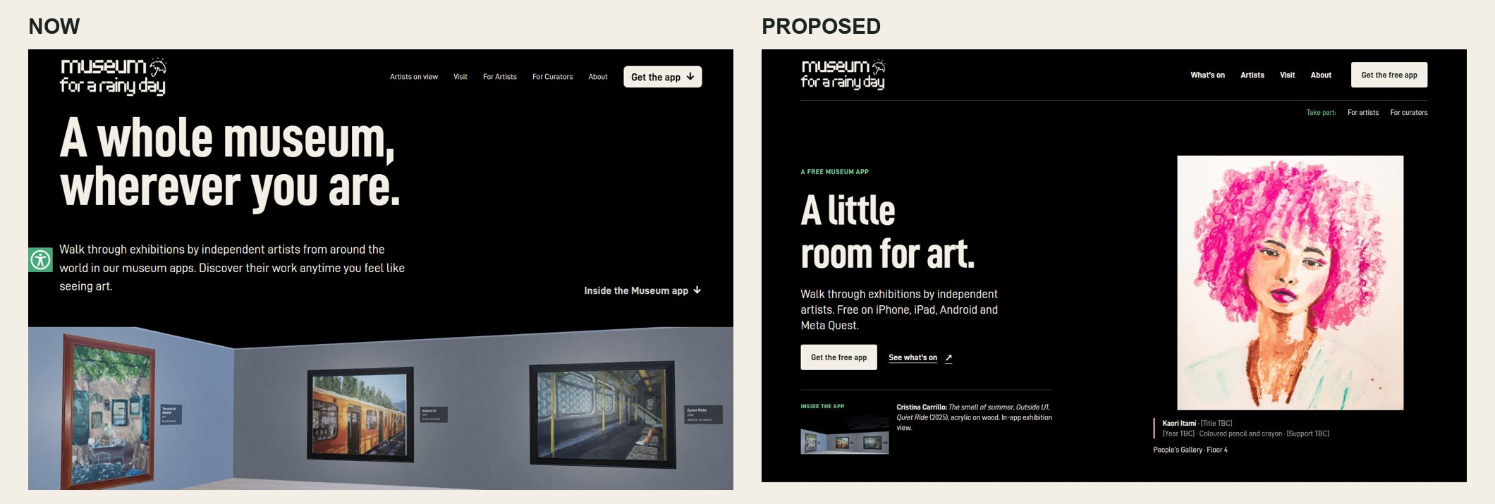
The verdict, in one line: the site looks like a museum’s signage but behaves like an app ad, and the art, the thing that should sell the app, is the least visible element on it.
All three specialists independently reached the same five conclusions:
- Lead with a whole, uncropped artwork. Today the hero is a text block beside empty black space. The paintings are cropped to strips, and Kaori Itami’s artist page has no artwork at all.
- Say “free museum app” in the first screen and put the store chooser second. At the moment “Admission free.” sits below a long hero.
- Show the real programme. Four floors exist (Manuel Höhne, Cristina Carrillo, Carol Koleszar, Kaori Itami), but the homepage carousel shows two artists behind arrows that do nothing.
- Give people a reason to come back: exhibition alerts, an “Opening next” slot, and share kits that let artists bring their own audiences. Right now RSS is the only way to follow.
- Earn trust like a museum: wall labels with titles, honest claims, an on-site page for curators and a real accessibility statement in place of an overlay widget.
The strongest page on the site today is For Artists. It has the floor plan, “3 of her 24 works” and in-app renders, all evidence the visitor-facing pages never use. The redesign carries that specificity everywhere.
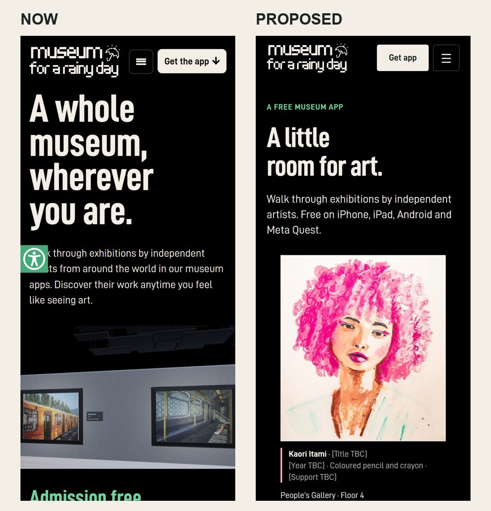
Before and after: homepage, first screen
2. The current site: what the panel saw
2.1 Homepage, first screen (desktop)
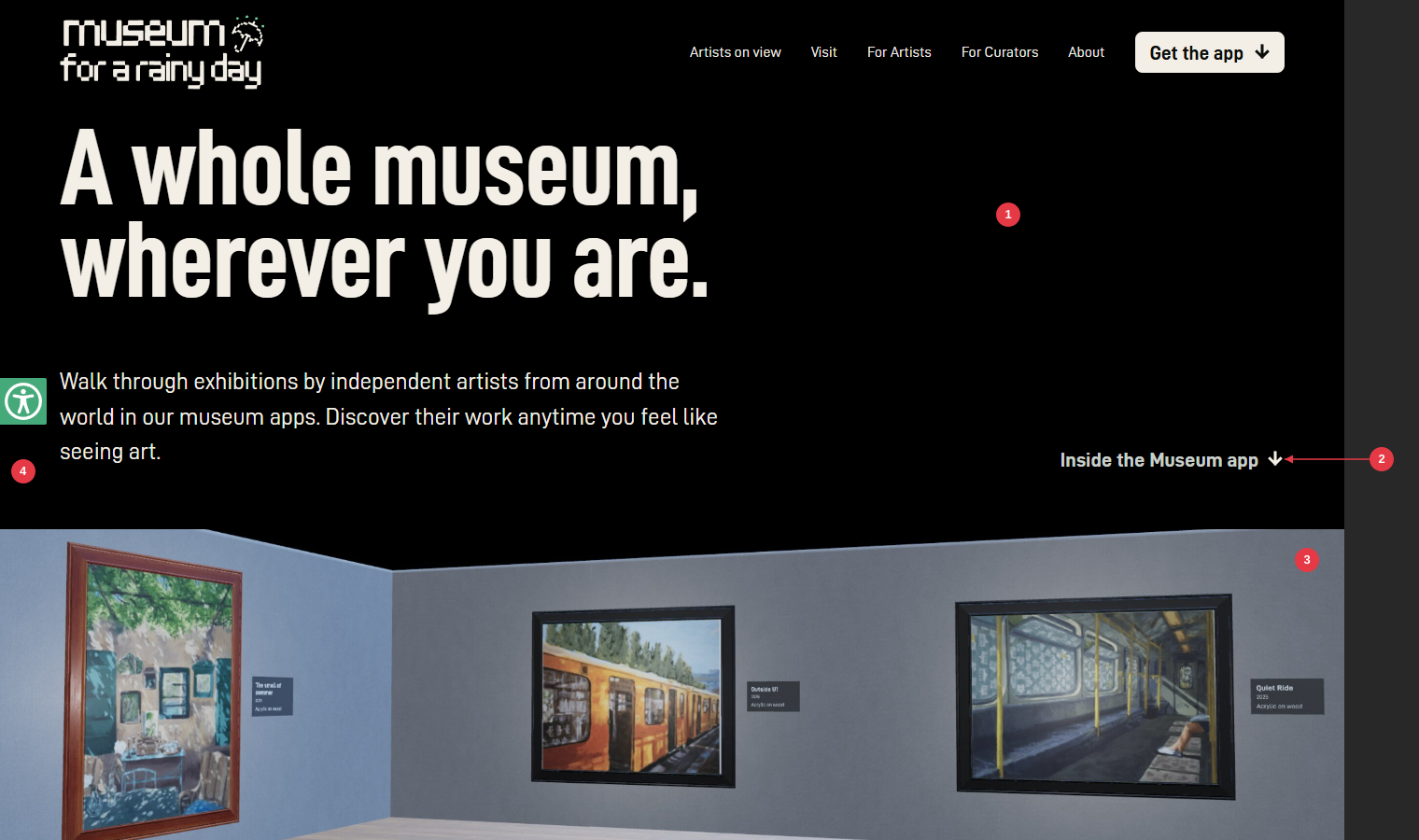
- Empty half-screen. The right half of the hero is black. The best asset, the art, isn’t there.
- “Inside the Museum app ↓” floats on its own, disconnected from the image it points to.
- The in-app render is cut to a 360 px strip. It is the only proof of the product, and its flat grey walls and flat light read as a default 3D scene rather than a gallery.
- The accessibility overlay tab sits halfway down the left edge on every page (see 2.2 for the mobile impact).
2.2 Homepage, first screen (mobile)
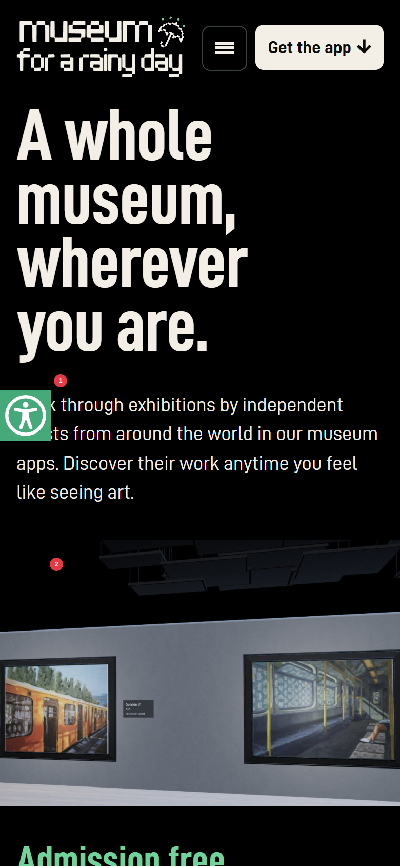
- The accessibility tab covers body copy (“Walk through…”, “artists”). It also covers headlines and labels as the visitor scrolls.
- The first part of the product image a phone user sees is the ceiling grid. The paintings come second.
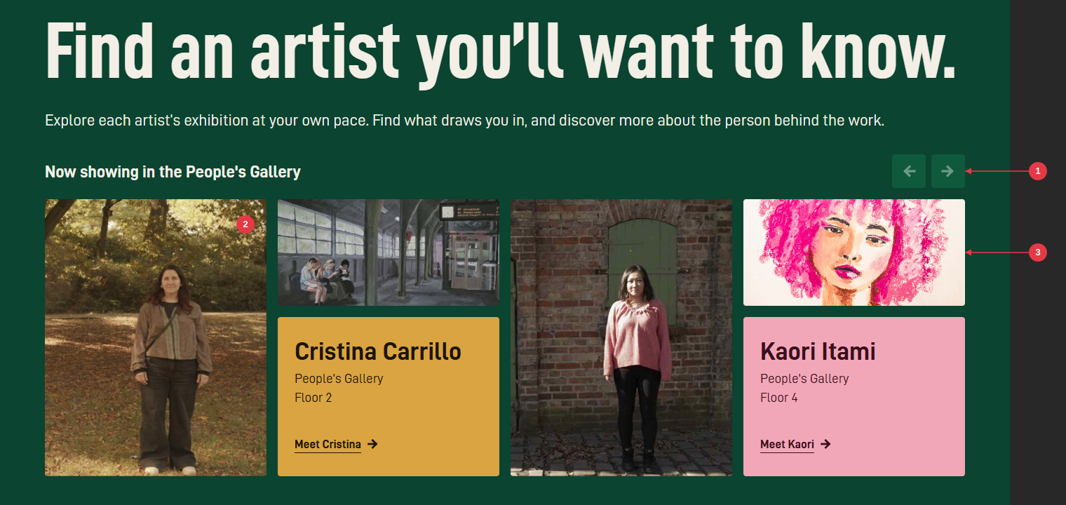
2.3 “Find an artist you’ll want to know.”
-
Carousel arrows for two artists. They link to
#and move nothing on desktop, which reads as “this is all there is”. The For Artists page names four artists. - Each artist’s photo is larger than their art. For a museum, the work should lead and the person should follow.
- The paintings are cropped to 2:1 strips. Kaori’s portrait loses everything but a band across the eyes.
2.4 Device chooser
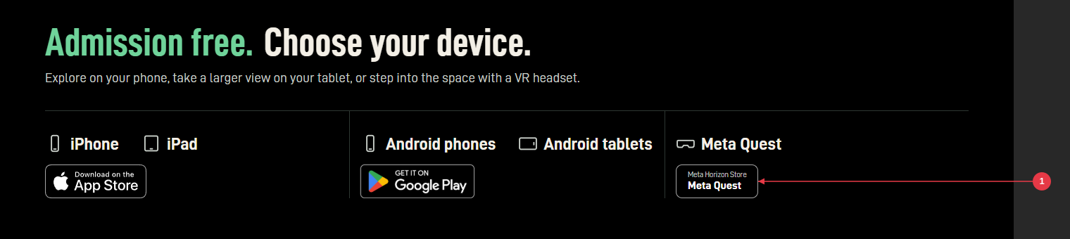
- The Meta Quest “badge” is a homemade text pill beside the official Apple and Google badges, so it reads as less trustworthy. The panel agreed not to fake Meta’s badge: use a clearly neutral button until Meta’s approved asset is supplied.
The section itself is good. “Admission free. Choose your device.” is the best line on the site, and every specialist kept it.
2.5 Artist page (Kaori Itami)
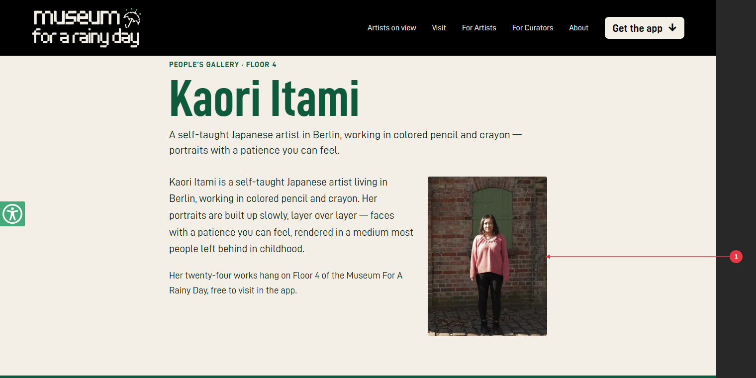
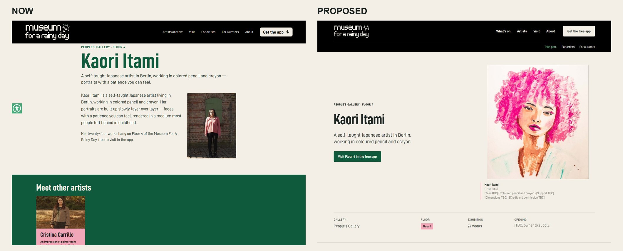
- The only image is a portrait photo of the artist. None of her 24 works appears, even though this is the page her own followers will land on.
Related problems on the other pages:
- Cristina’s page shows one painting, captioned only “Cristina Carrillo”.
- In “Meet other artists”, Cristina’s card is pink (on the homepage she is mustard).
- Both pages end in a large download panel rather than more of the work.
2.6 Other pages
| Page | What works | What doesn’t |
|---|---|---|
| For Artists | The richest page: floor plan, “3 of her 24 works”, in-app renders, clear rights (“Your work stays yours”), “No exhibition fee. Free to propose.” | Very long. Six full-width colour bands keep pulling related arguments apart before the practical questions arrive. |
| Visit | FAQ answers the right questions (ticket, account, physical location). | It opens with a giant “Visit” masthead and a blog teaser headed “List of Supported Devices”. The FAQ’s device list omits Meta Quest. |
| About | An honest origin story (a rainy Sunday, an archive of photographs) and a candid “not a non-profit”. | Four text-only pastel slabs and no art. It says the museum is “primarily VR” while the homepage leads with phones. “Find out more how you can help” has no link. |
| For Curators | n/a | The main-nav link jumps without warning to a contact form on lenguart.com. |
2.7 Measured issues the panel flagged
| Issue | Evidence |
|---|---|
| Headline scale is inverted: the closing headline is the biggest on the page | H1 118 px; “Find an artist…” 115 px; “Visit the Museum.” 144 px |
| Unbacked superlative | “Be seen on more screens than any other app” (homepage, For artists link) |
| Placeholder text on the live site | Alt text: “Painting by Cristina Carrillo … (title to confirm)” |
| The app already has wall labels the site never uses | The in-app render shows The smell of summer, Outside U1 and Quiet Ride (2025, acrylic on wood) |
| Redundant page title | “The Museum For A Rainy Day (MFARD) - Museum For A Rainy Day - Art Anytime. On Your Device.” The tagline appears nowhere on the page. |
| Misspelled artist URL | /artists/cristina-carillo/ (the artist is Carrillo) |
| Two analytics trackers at once | Clicky and PostHog load on every page |
| Two artists missing from the visitor pages | Manuel Höhne (Floor 5) and Carol Koleszar (Floor 7) appear only on For Artists. Floors 1, 3 and 6 are never mentioned. |
3. The redesign
3.1 Direction
| Seat | Their one-line direction |
|---|---|
| Designer | “A quiet place to look”: an artwork-led, editorial museum site with a clear invitation to install the free app. Not a tech showcase, not a fake virtual tour in the browser. |
| Marketer | Sell a specific encounter first, explain the free app immediately, and turn each exhibition into a reason to visit, share and return. |
| Curator | A small, carefully run museum with an app entrance, not an app advertisement with occasional artist biographies. |
These are one direction seen from three sides. The binding decisions (G:\Museum-for-a-rainy-day\review\specialists\SYNTHESIS.md):
- Homepage H1: “A little room for art.” (marketer), with the eyebrow “A free museum app” (designer).
- Art is never cropped. Each work is contain-fit on cream with a wall label beneath (curator).
- Navigation: What’s on · Artists · Visit · About, plus the button Get the free app. A secondary “Take part:” row holds For artists · For curators.
- The store chooser is always the second thing you meet, on Home, artist pages and Visit.
- Retention: “Know when a new exhibition opens.” alert strip on every visitor page.
- The “rainy day” idea stays out of the art and appears as a light editorial touch: the alert eyebrow “For your next rainy day” and the footer line.
- The accessibility overlay is removed; a statement page replaces it.
3.2 Sitemap
Now showing · Floor directory · Opening next"] H --> A["Artists (new index)"] H --> V[Visit] H --> AB[About] W --> C["Artist page: Cristina Carrillo · Floor 2"] W --> K["Artist page: Kaori Itami · Floor 4"] A --> C A --> K A -.-> MH["Manuel Höhne · Floor 5
(record, page once work is supplied)"] A -.-> CK["Carol Koleszar · Floor 7
(record, page once work is supplied)"] H --> FA[For Artists] H --> FC["For Curators (new, on-site)"] FA --> GROW[(GROW portal)] FC --> LC[(Lenguart contact)] C --> S{{Store chooser}} K --> S V --> S H --> S
3.3 Home
 |
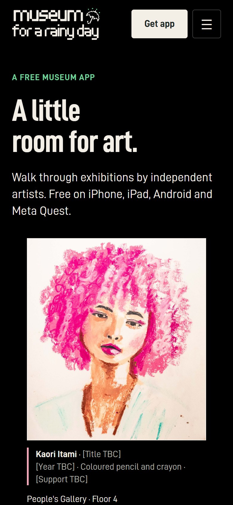 |
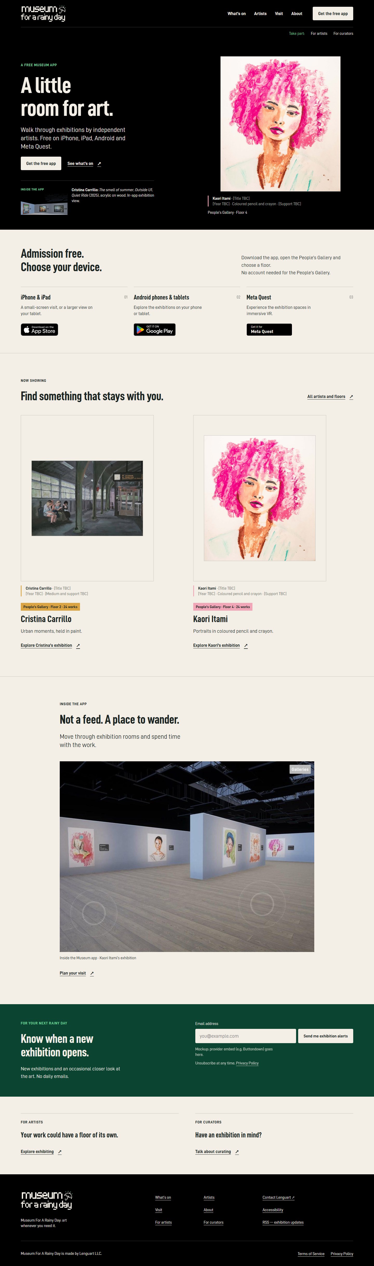
| # | Section | Content | Why |
|---|---|---|---|
| 1 | Threshold | “A FREE MUSEUM APP” / A little room for art. / “Walk through exhibitions by independent artists. Free on iPhone, iPad, Android and Meta Quest.” / Get the free app · See what’s on. Kaori Itami’s full portrait with its wall label, plus a small “Inside the app” view carrying the verified labels. | Desire and product clarity in one screen (all three seats) |
| 2 | Admission free. Choose your device. | Three equal panels: iPhone & iPad, Android phones & tablets, Meta Quest. “No account needed for the People’s Gallery.” | Removes cost and device doubt before any scroll (marketer, designer) |
| 3 | Find something that stays with you. | Two artwork-led cards (Cristina, Floor 2, 24 works; Kaori, Floor 4, 24 works) with “All artists and floors”. No carousel. | Shows a programme, not two lonely slides |
| 4 | Not a feed. A place to wander. | A full in-app view of Kaori’s exhibition with the on-screen controls visible | Proves the spatial experience the app sells |
| 5 | Know when a new exhibition opens. | Eyebrow “For your next rainy day”; email field and “Send me exhibition alerts”; “No daily emails.” | The first return path the site has ever had |
| 6 | Take part | “Your work could have a floor of its own.” / “Have an exhibition in mind?” | Recruitment kept, but small |
3.4 What’s on (new)
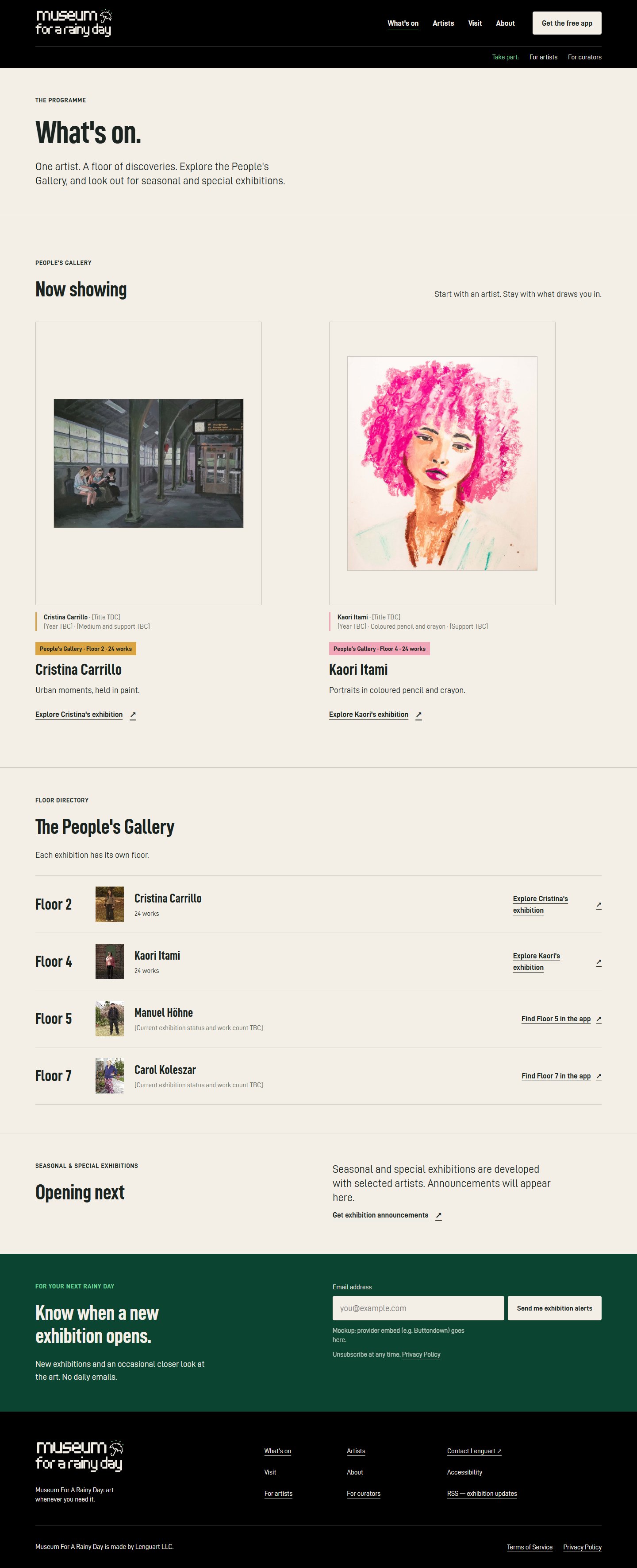 |
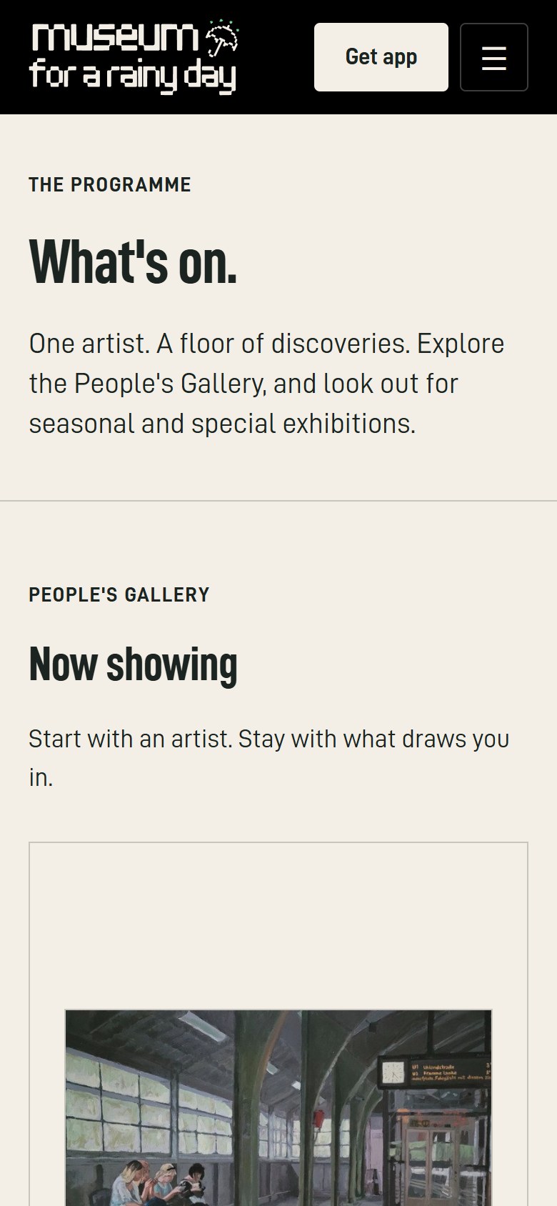 |
This page is the curator’s programme made visible:
- Now showing.
- The People’s Gallery floor directory (Floors 2, 4, 5 and 7 as a real list).
- Opening next, which honestly says “Announcements will appear here” and sits beside the alert signup.
- Past exhibitions is added once there is real history.
Manuel’s and Carol’s rows show “[Current exhibition status and work count TBC]” until the owner confirms them. Nothing is invented.
3.5 Artists (new index)
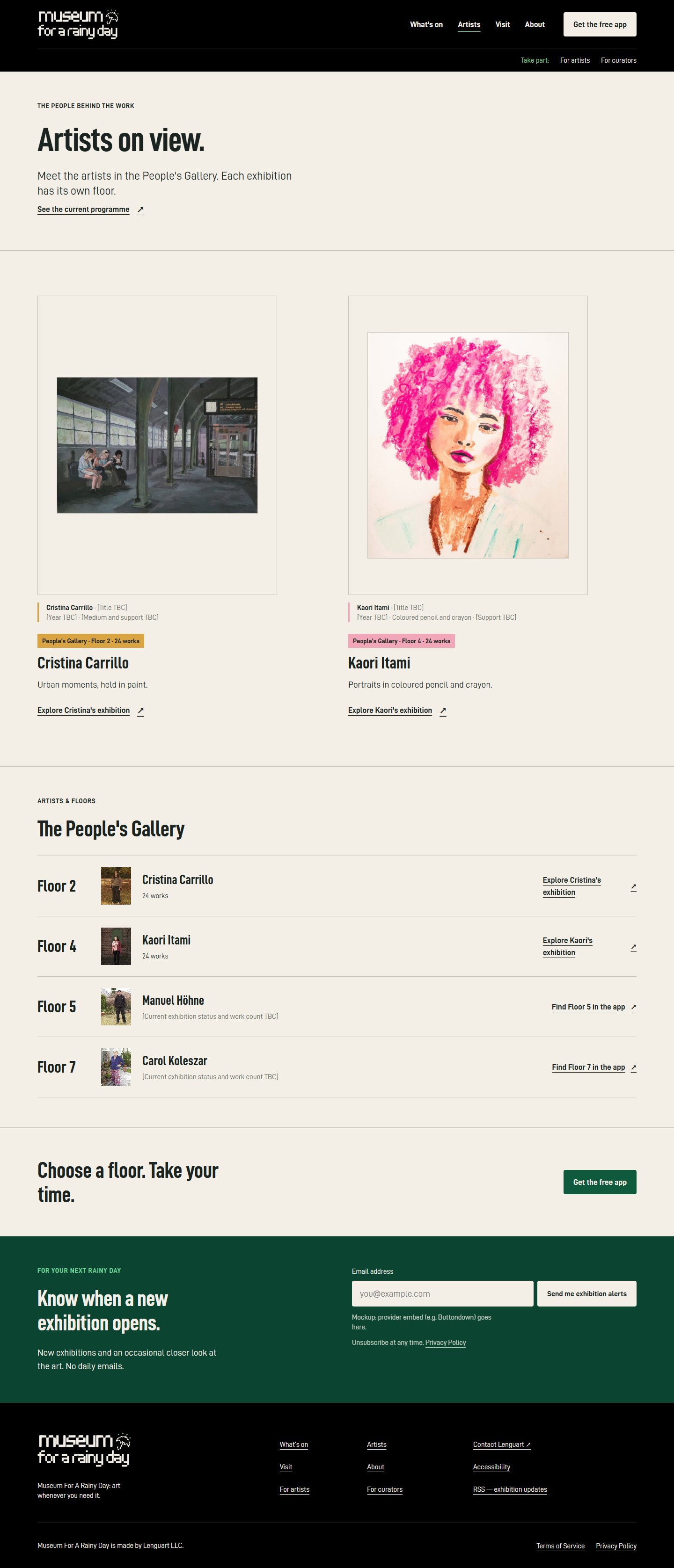 |
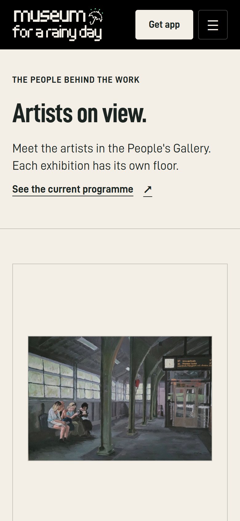 |
Orchestrator note: with only four artists, What’s on and Artists overlap heavily. Launching with What’s on only is a reasonable simplification. Add the Artists index when the roster passes roughly six to eight artists, or once past exhibitions exist.
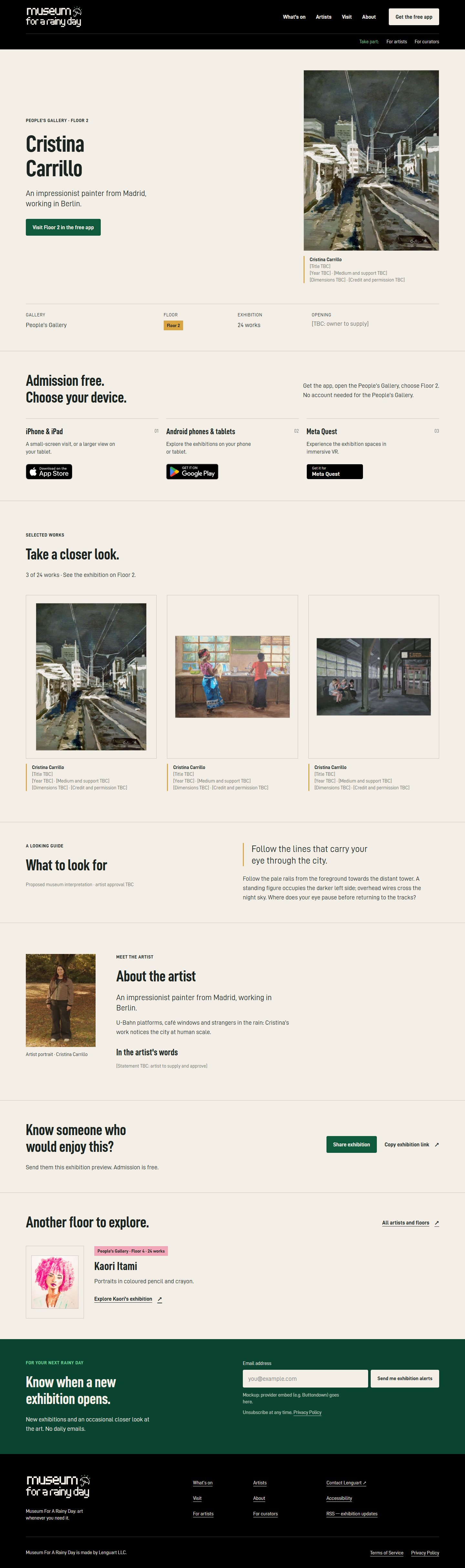
3.6 Artist page template: Cristina Carrillo (three real works)
 |
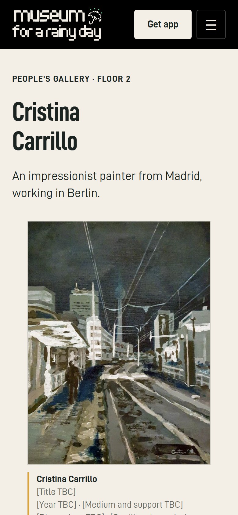 |
The section order merges the designer’s layout, the curator’s artist-page anatomy and the marketer’s referral loop:
- Artwork-led hero. The full night-tracks painting with its wall label; “PEOPLE’S GALLERY · FLOOR 2”; Visit Floor 2 in the free app.
- Fact strip: Gallery · Floor · 24 works · Opening [TBC].
- Store chooser with the wayfinding “Get the app, open the People’s Gallery, choose Floor 2.” There is no deep link: the app doesn’t verifiably support one, so none is promised.
- Take a closer look. Three labelled works, “3 of 24 works”.
- What to look for. The curator’s looking guide: “Follow the lines that carry your eye through the city.” It is marked as a proposed interpretation awaiting the artist’s approval.
- About the artist. A small portrait after the work, plus “In the artist’s words” [statement to be supplied].
- Know someone who would enjoy this? Share exhibition / Copy exhibition link (the marketer’s referral loop).
- Another floor to explore.
- Exhibition alerts.
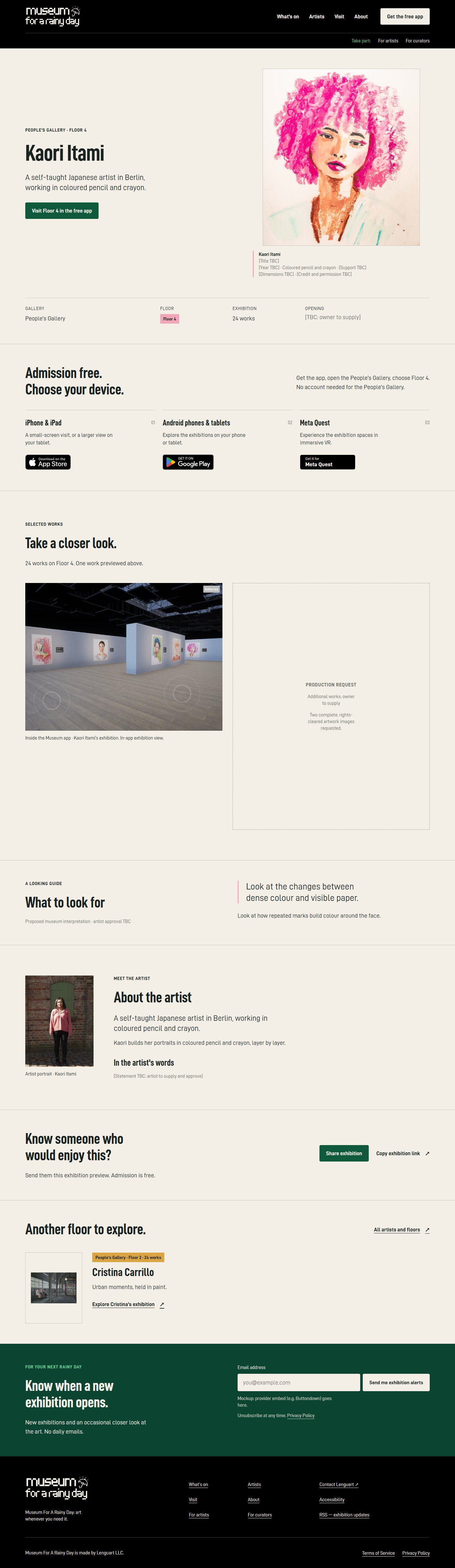
3.7 Artist page template: Kaori Itami (one real work, gap shown honestly)
 |
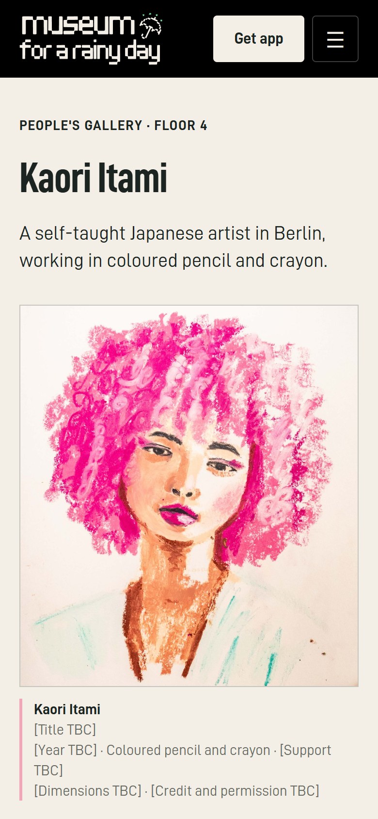 |
Kaori’s missing works appear as a dashed “Production request: additional works, owner to supply” frame, not as repeated crops or invented art. The comparison below is the single biggest content fix on the site:
3.8 Visit
 |
 |
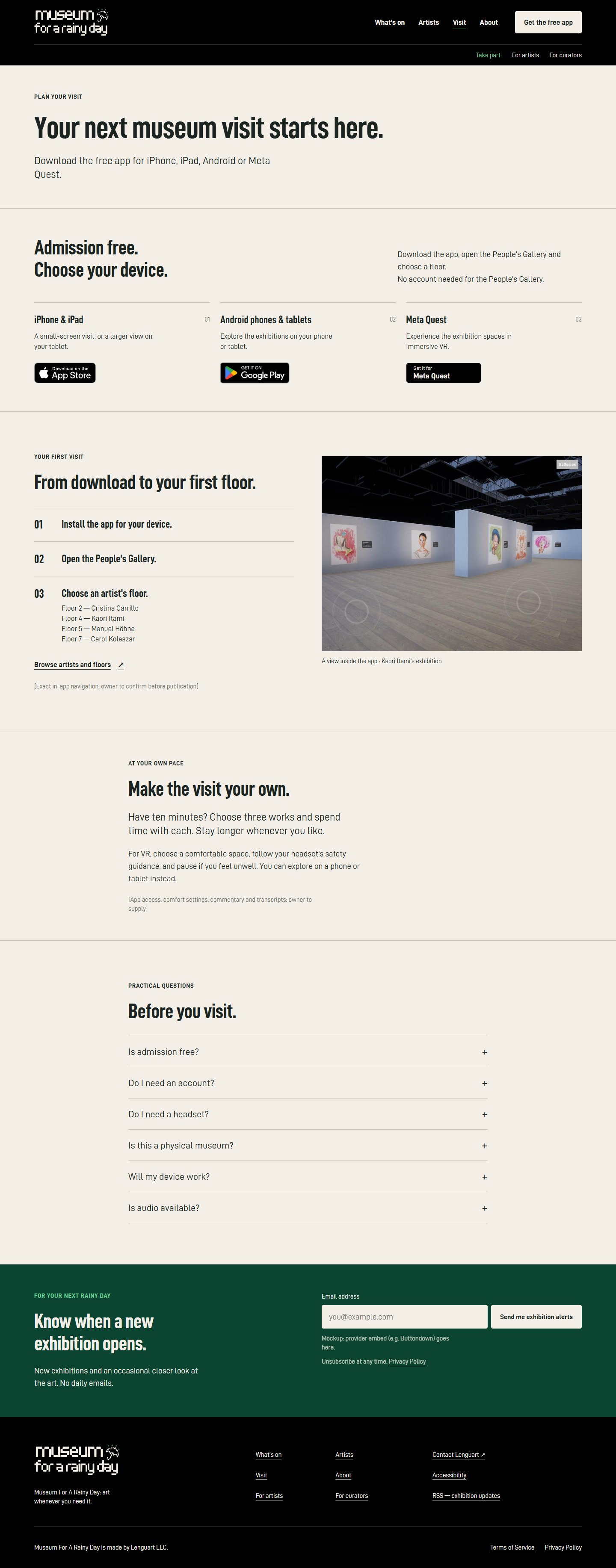
The page runs in this order:
- “Your next museum visit starts here.”
- All three stores, straight away.
- From download to your first floor (Install → Open the People’s Gallery → Choose an artist’s floor, beside the floor list).
- Make the visit your own: the curator’s line “Have ten minutes? Choose three works and spend time with each.”, plus VR comfort guidance.
- Before you visit: an FAQ that now includes Meta Quest and “Do I need a headset?”.
3.9 For Artists
 |
 |
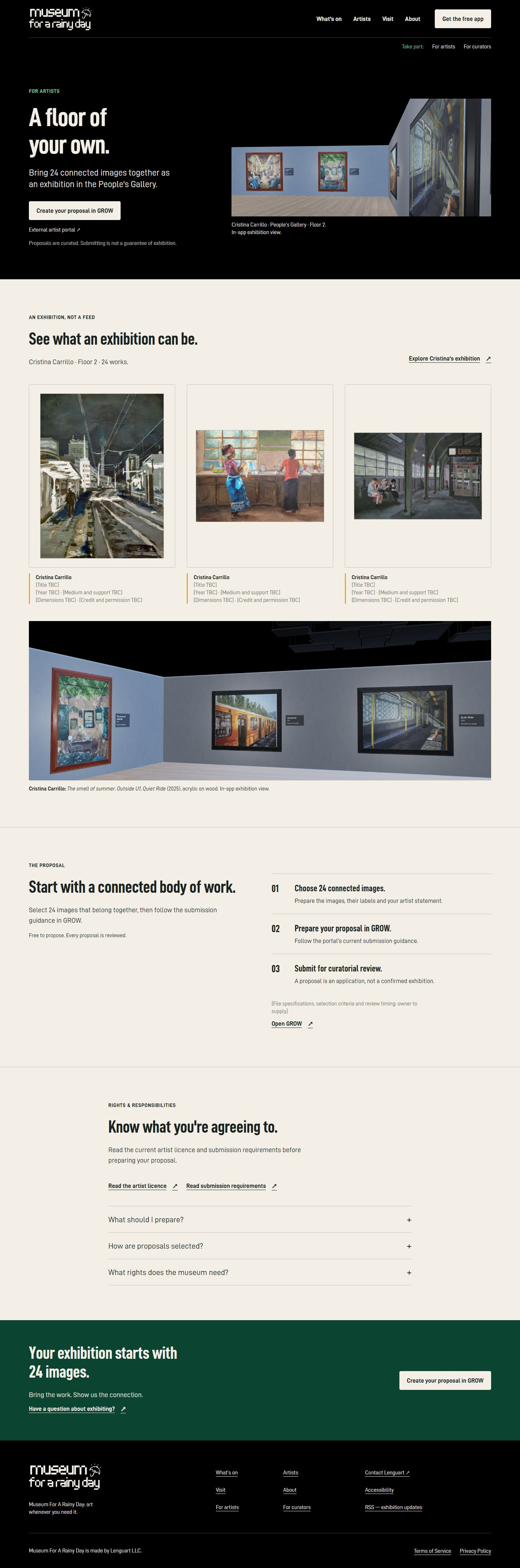
The page is condensed from six colour bands to four sections:
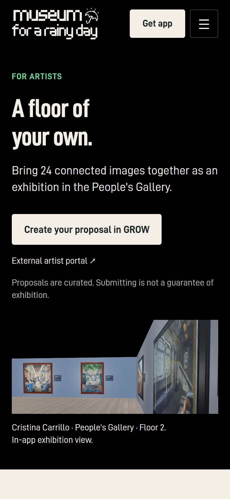
- A floor of your own. “Bring 24 connected images together as an exhibition in the People’s Gallery.” / Create your proposal in GROW. Supporting line: “Proposals are curated. Submitting is not a guarantee of exhibition.”
- See what an exhibition can be. Cristina’s three works and the labelled room view as evidence.
- Start with a connected body of work. Three steps.
- Know what you’re agreeing to, with links to the artist licence and the submission requirements.
The “more screens than any other app” claim is gone.
3.10 For Curators (new, on-site)
 |
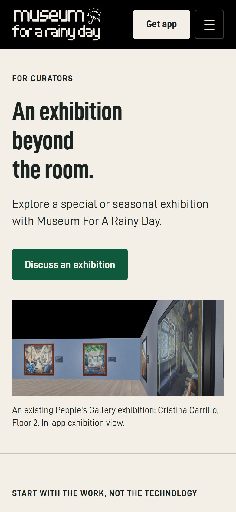 |
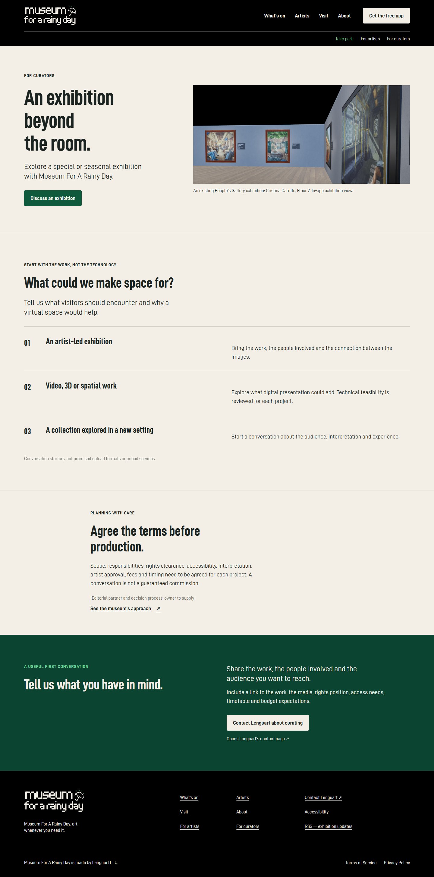
The page explains the collaboration before anyone leaves the site:
- “An exhibition beyond the room.”
- What could we make space for? An artist-led exhibition; video, 3D or spatial work; a collection explored in a new setting. These are framed as conversation starters, not promised services.
- Agree the terms before production.
- Then a clearly labelled hand-off: Contact Lenguart about curating (opens Lenguart’s contact page).
3.11 About
 |
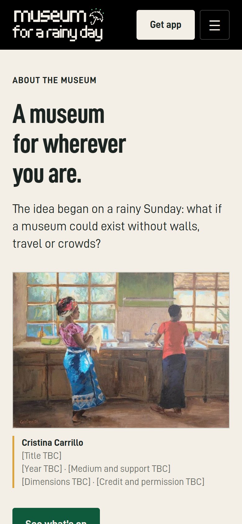 |
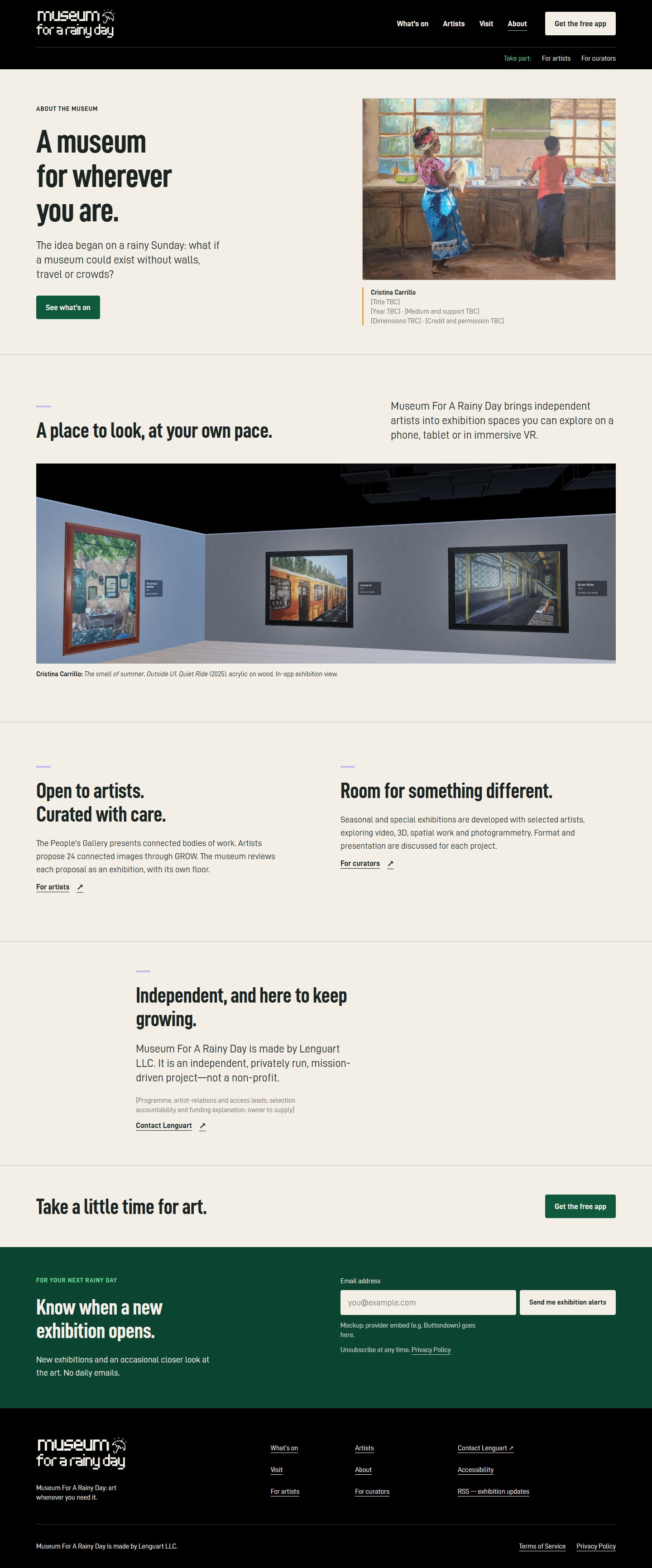
The four pastel slabs become cream reading space with small lilac section markers, an artwork, and the room view cropped so it no longer opens on the ceiling. The page:
- calls phones, tablets and VR equal ways in, which ends the “primarily VR” contradiction;
- names Lenguart LLC plainly;
- replaces the dead-end “help us” line with “Take a little time for art” and Get the free app.
4. Visual system (designer)
Type: D-DIN family, one display-size heading per page
| Role | Desktop size / line height | Mobile size / line height | Face |
|---|---|---|---|
| Display (Home only) | 88 / 88 | 52 / 52 | D-DIN Condensed Bold |
| H1 (internal pages) | 72 / 76 | 44 / 48 | D-DIN Condensed Bold |
| H2 | 48 / 52 | 34 / 38 | D-DIN Condensed Bold |
| H3 | 28 / 32 | 25 / 30 | D-DIN Condensed Bold |
| Lead | 24 / 32 | 20 / 28 | D-DIN |
| Body | 19 / 29 | 18 / 27 | D-DIN |
| Caption / wall label | 15 / 21 | 15 / 21 | D-DIN |
Compare the current scale: 118, 115 and 144 px headlines all competing on one page.
Colour roles: the palette is kept; its job changes
| Colour | Hex | New role |
|---|---|---|
| Cream | #F3EFE6 |
Gallery walls and reading surfaces: the default background for art |
| Ink | #1B2420 |
Text on cream |
| Black | #000000 |
Header, home threshold, footer |
| Deep green | #0B4430 |
The invitation surface (alerts, final calls to action) |
| Button green | #0F5A3D |
Primary button on cream |
| Mint | #6FD39A |
Eyebrows and accents on dark backgrounds only |
| Mustard / Pink | #D9A441 / #F2A7B8 |
Small artist identifiers (floor chip, label rule) for Cristina and Kaori. No more full-colour slabs. |
| Lilac | #C9B8F2 |
About-page section markers |
Image rules (designer and curator)
- Artworks are contain-fit on cream at their natural ratio, never cropped, tinted or overlaid with text.
- Room renders are cropped to the lower wall and never lead with the ceiling.
- Artist portraits come after the work, at roughly 70:30 emphasis, captioned “Artist portrait”.
- Motion: no carousels, parallax or rain loops. A future 20-second walkthrough must be user-started, captioned and keyboard-operable.
5. Marketing plan (marketer)
Positioning
-
Audiences, ranked:
- Art-curious phone and tablet users arriving through an artist, search or social post.
- Returning visitors.
- Quest owners looking for culture.
- Independent artists.
- Curators.
- Positioning statement: Museum For A Rainy Day is a free virtual art museum where you can walk through curated exhibitions by independent artists on your phone, tablet or Meta Quest.
- Taglines: “A little room for art.” (main, and the chosen H1) · “A rainy day. A whole museum.” (recurring editorial line) · “Independent art. Your own pace.”
Messaging hierarchy
| Page | The visitor should go from… |
|---|---|
| Home | this art interests me → it’s a museum app → admission is free → my device works → store |
| Artist | I want to see this work → I know where to find it (Floor N) → install → share or return |
| Visit | I can visit with what I own → I understand the steps → the right store |
| For Artists | a connected exhibition is valuable → I understand 24 images and the terms → GROW |
Retention and growth loops
-
Exhibition alerts. A Buttondown hosted embed, double opt-in, “No daily emails”. Welcome sequence:
- Day 0: “Your first rainy-day visit” (start with Cristina on Floor 2).
- Day 3: “Take a closer look at Kaori’s portraits”.
- Day 10: “Who would you take to the museum?”
- Promotional email is capped at two per month.
-
Artist share kit, for each artist:
- a UTM link;
- a 1080×1350 feed image, a 1080×1920 story and a 1200×630 OG image;
- a caption and an A4 QR poster linking to the artist page.
Proposed caption: “My exhibition is on Floor 4 of Museum For A Rainy Day. Explore 24 works in the free app for phone, tablet or Meta Quest.”
-
Channels:
- Instagram, email and the artists’ own audiences.
- Weekly cadence: one full-work carousel, one 15–20-second captioned in-app walkthrough, and three story frames.
-
Social proof: only verifiable evidence (real works, named artists, transparent operation). There is no ratings or quotes module until genuine ones exist.
Funnel and tracking
- One analytics provider. The site currently loads both Clicky and PostHog. Export baselines, then cut over to a single privacy-friendly provider. The marketer proposes Plausible; the point is a single tracker, not a third one.
-
Events:
-
store_clickwith astoreproperty ofapple,googleormeta(intent, not an install); -
email_signup_submit; -
artist_preview_click; -
grow_proposal_start_click; -
curator_contact_click; -
share_link_copy.
-
-
Store attribution:
-
App Store links carry
pt=(provider token from App Store Connect, owner to supply) andct=(campaign). -
Google Play links carry a URL-encoded
referrer=utm_…. - Meta is tracked as clicks only.
-
App Store links carry
-
First A/B tests:
- “A little room for art.” vs “A free art museum. On your device.”
- Stores after the hero vs after the artwork, on artist pages.
- Alert headline wording.
Page titles and descriptions
| Page | Title | Description |
|---|---|---|
| Home | Museum For A Rainy Day — Free Virtual Art Museum | Walk through curated exhibitions by independent artists. Visit free in the app for iPhone, iPad, Android or Meta Quest. |
| Cristina | Cristina Carrillo, Floor 2 — Museum For A Rainy Day | Discover Cristina Carrillo’s paintings of urban life. Preview her work, then explore 24 works on Floor 2 in the free museum app. |
| Kaori | Kaori Itami, Floor 4 — Museum For A Rainy Day | Explore Kaori Itami’s coloured-pencil and crayon portraits. Preview her work, then visit 24 works on Floor 4 in the free museum app. |
| Visit | Get the Free Museum App — Museum For A Rainy Day | Choose the App Store, Google Play or Meta Horizon Store. Find out how to visit the People’s Gallery on your phone, tablet or Meta Quest. |
| For Artists | Exhibit Your Art — Museum For A Rainy Day | Propose an exhibition of 24 connected images through GROW. See an exhibition example and learn what to prepare before you apply. |
| For Curators | Curatorial Collaborations — Museum For A Rainy Day | Explore ideas for curated virtual exhibitions, including video, 3D and spatial work. Tell Museum For A Rainy Day about your project. |
| About | About the Museum — Museum For A Rainy Day | Learn about the People’s Gallery, special exhibitions and the independent, privately run museum operated by Lenguart LLC. |
- OG images: 1200×630, with the full artwork occupying about 65% of the frame plus a cream label panel (artist · floor · “Admission free.”).
-
Structured data:
Organization,WebSite,Personfor each artist, andMobileApplication/SoftwareApplication. UseExhibitionEventonly for confirmed dates, and never a fake physicalMuseumaddress. -
Redirect:
/artists/cristina-carillo/→/artists/cristina-carrillo/.
6. Curatorial standards (curator)
Curatorial voice: rewrites of current copy
| Now | Proposed | Rule |
|---|---|---|
| “portraits with a patience you can feel” | “Kaori Itami makes portraits in coloured pencil and crayon.” | Name the practice; don’t prescribe the feeling |
| “rendered in a medium most people left behind in childhood” | “Look at how repeated marks build colour around the face.” | Never diminish a medium to praise the artist |
| “Be seen on more screens than any other app” | “An exhibition of your own. Across phones, tablets and VR.” | No unsupported comparisons |
| “Let’s make something great!” | “Propose an exhibition for a virtual museum.” | Make the invitation specific |
| “exists primarily in immersive virtual reality” | “Visit on your phone or tablet, or experience the galleries in immersive VR on Meta Quest.” | Every audience gets a legitimate way in |
Wall-label standard
Labels go directly under the work, never behind a hover. The fields, in order:
- artist;
- title;
- year;
- medium and support;
- original dimensions in cm;
- credit or copyright;
- an optional 40–70-word interpretation.
Filled example for Cristina’s night-tracks painting (unknowns stay unknown):
Cristina Carrillo [Title TBC], [Year TBC] [Medium and support TBC] [Height TBC] × [Width TBC] cm [Credit line and copyright TBC] Looking closer: Follow the pale rails from the foreground towards the distant tower. A standing figure occupies the darker left side; overhead wires cross the night sky. Where does your eye pause before returning to the tracks?
The app already holds label data (The smell of summer, Outside U1, Quiet Ride 2025, acrylic on wood). The website should reuse the app’s records rather than re-typing them.
Programme
- Use Now showing / Opening next / Past exhibitions, with the floor directory as a real text list.
- Distinguish the People’s Gallery from Seasonal and special exhibitions. Until a special exhibition is announced, the page says so plainly; there is no fictional season or countdown.
- One named programme editor keeps the directory in sync with the app.
Visitor experience
-
Present Visit as “plan your visit”:
- phone = a small-screen visit;
- tablet = a larger view;
- Quest = immersive VR.
- Publish audio-commentary coverage per exhibition. There is no website autoplay.
- VR comfort line: “Choose a comfortable space, follow your headset’s safety guidance, and pause if you feel unwell. You can explore on a phone or tablet instead.”
Institutional trust
About names:
- Lenguart LLC as the operator;
- the people responsible for programme, artist relations and access;
- the selection approach and the funding model.
It implies no board, accreditation or charity status.
For Artists explains:
- application versus selection;
- who reviews, and on what criteria;
- the licence term and withdrawal.
Accessibility statement: separate sections for the website, mobile apps and Quest. The curator cites MoMA’s access page (https://www.moma.org/visit/accessibility/) as a model of the right specificity.
7. Combined priority list
Merged from the three specialists’ top-10 lists. “Agree” counts how many seats ranked the change in their top 10.
| # | Change | Agree | Effort |
|---|---|---|---|
| 1 | Art-led Home hero: a full Kaori artwork and “A free museum app” in the first screen | 3/3 | M |
| 2 | Rebuild both artist pages on the artwork-first template, with Kaori’s real work on her page | 3/3 | M |
| 3 | Store chooser as the second section on Home, artist pages and Visit; fix the Visit FAQ to include Quest | 3/3 | S |
| 4 | Replace the carousel with a static grid and the four-floor directory (What’s on page) | 3/3 | M |
| 5 | Obtain titles, years, media and credits; add wall labels; remove the “(title to confirm)” placeholder | 2/3 | M |
| 6 | Exhibition-alert signup and welcome sequence | 3/3 | M |
| 7 | One type scale and one display heading per page; cream reading surfaces; artist colours as small identifiers | 1/3 | M |
| 8 | Remove the accessibility overlay; publish a real access statement | 2/3 | S–M |
| 9 | On-site For Curators page; condense For Artists; drop the superlative | 3/3 | M |
| 10 | Artist share kits and per-artist UTM links; consolidate analytics to one provider; titles, OG, redirects | 1/3 | M |
Items 1, 3, 4, 6 and 8 can ship with the assets you already have. Items 2 and 5 need artwork data and images from you (see section 9). All three seats specified a type scale in their designs; only the designer ranked it in their top 10, which is why item 7 shows 1/3.
8. Measures of success
All targets are proposals. Measure a clean four-week baseline first; none of the three seats invented current figures.
| KPI | Proposed target | Note |
|---|---|---|
| Home → store-click rate (mobile) | +25% relative within 90 days | Report Apple, Google and Meta separately; a click is not an install |
| Visit → store-click rate | 50% of Visit sessions | |
| Artist discovery (Home → artist or What’s on) | 25–30% of Home sessions | Card-level events, not carousel impressions |
| Artist page → store | +20% relative | Track by artist and floor |
| Confirmed alert signups | 2–3% of exposed sessions | Provider-confirmed, double opt-in |
| Presentation integrity | 100% of works full-frame, titled and credited; zero public “TBC” | Launch gate |
| Five-second test | 8/10 first-time viewers can say “free museum app” and name their device | Moderated check |
| Mobile usability | Zero covered text at 390 px and 200% zoom | Launch gate |
9. What we need from you (consolidated open questions)
- Artwork data. Titles, years, media, dimensions, credits and web/social reproduction permission for every image. Do the supplied tiles show the complete originals?
- Programme status. Are Manuel Höhne (Floor 5) and Carol Koleszar (Floor 7) visitable now? Supply their work counts, biographies and artwork previews, plus opening dates for all floors. What is on Floors 1, 3 and 6, if anything? The directory should explain the gaps or the numbering.
- Kaori. Two more rights-cleared works and a genuine installation capture.
- Stores. The approved Meta Quest badge; the App Store Connect provider token; any deep-link support (none is assumed).
- App facts. First-visit navigation per platform, audio-commentary coverage, Quest comfort options, minimum OS versions and download size.
- People. Who is named for programme, artist relations and access; who sends emails and replies to enquiries.
- Platform. Can Metro Publisher set per-page head metadata, permanent redirects and provider embeds (Buttondown, a hosted form)?
- Overlay. Is the accessibility widget under contract, or can it be removed?
- Walkthrough video. Can you supply a real 20-second captioned app walkthrough? This is optional; the design works with stills.
- Curators. Which collaborations can you genuinely support, technically and financially, before inviting proposals?
Appendix: files
Specialist designs and decisions
-
G:\Museum-for-a-rainy-day\review\specialists\BRIEF.md: shared brief given to all three seats -
G:\Museum-for-a-rainy-day\review\specialists\01-website-designer.md -
G:\Museum-for-a-rainy-day\review\specialists\02-online-marketer.md -
G:\Museum-for-a-rainy-day\review\specialists\03-museum-curator.md -
G:\Museum-for-a-rainy-day\review\specialists\SYNTHESIS.md: orchestrator decisions binding the mockups
Working HTML mockups (open directly in a browser; fonts and images are local)
-
G:\Museum-for-a-rainy-day\review\mockup\index.html -
G:\Museum-for-a-rainy-day\review\mockup\whats-on.html -
G:\Museum-for-a-rainy-day\review\mockup\artists.html -
G:\Museum-for-a-rainy-day\review\mockup\artist-cristina.html -
G:\Museum-for-a-rainy-day\review\mockup\artist-kaori.html -
G:\Museum-for-a-rainy-day\review\mockup\visit.html -
G:\Museum-for-a-rainy-day\review\mockup\for-artists.html -
G:\Museum-for-a-rainy-day\review\mockup\for-curators.html -
G:\Museum-for-a-rainy-day\review\mockup\about.html -
G:\Museum-for-a-rainy-day\review\mockup\styles.css
Images
-
G:\Museum-for-a-rainy-day\review\images\current\: full-page captures of every live page (<page>-desktop.pngat 1440 px and<page>-mobile.pngat 390 px @2x) -
G:\Museum-for-a-rainy-day\review\images\annotated\: callout SVGs used in section 2 -
G:\Museum-for-a-rainy-day\review\images\proposed\: mockup renders (<page>-desktop.jpgfull page,<page>-desktop-fold.jpg,<page>-mobile.jpg,<page>-mobile-fold.jpg) -
G:\Museum-for-a-rainy-day\review\images\compare\: before/after composites -
G:\Museum-for-a-rainy-day\review\assets\: the real site assets and D-DIN fonts the mockups use