ChatGPT (GPT Image)
Prompt 1
show prompt
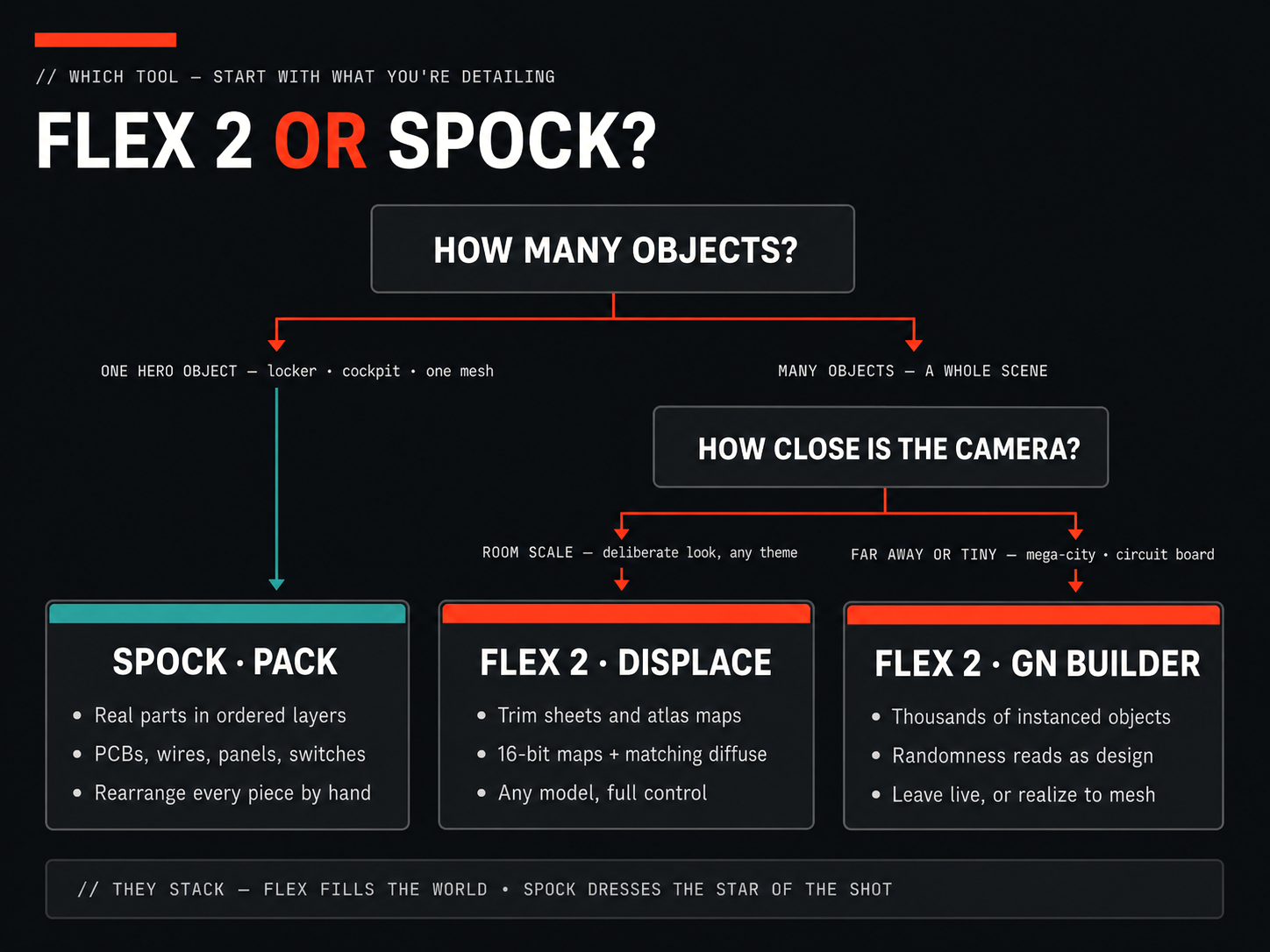
# flex-spock-decision-tree — prompts Concept brief: a decision-tree infographic answering "Flex 2 or SPOCK?" — two question nodes, three leaf cards (two Flex = orange, one SPOCK = teal), footer "they stack" strip. Toolmaker Noir theming per D:\GitHub\Brand-Mktg\chatGPT-infographic-prompt.md, applied verbatim. One engine (ChatGPT/GPT Image), one concept, 4:3 landscape. ## chatgpt ### Concept 1 Create a 4:3 landscape decision-tree infographic poster for a Blender add-on brand. Intended use: full-width website graphic. STYLE — CHIPPWALTERS "Toolmaker Noir": premium dark editorial software design with industrial-design precision. Restrained, confident, flat matte. NOT gaming, NOT cyberpunk, NOT neon, NOT a generic AI-startup gradient poster. PALETTE (exact, never substitute): - Background: flat desaturated near-black charcoal #0E1013 — never navy, never blue-cast; no texture, no gradient. - Cards/panels: slightly lifted charcoal #1B1F25 with a thin crisp #2B3037 outline, rounded corners. - Headings: soft white #F3F4F5 (never stark pure white). Body text: light gray #C2C7CE, same typeface as headings, smaller. - Dominant accent: orange-red #FE4023 — badges, arrows, eyebrow bar, the two FLEX leaf card headers. Small percentage of the frame; it directs attention, never floods. - Secondary accent: muted teal #3FBBA9 — used ONLY for the SPOCK leaf card header and its connector arrow. TYPE: clean bold geometric grotesque sans-serif (Space Grotesk / Futura style) for headings; the same sans, smaller and light gray, for body. Small letterspaced UPPERCASE monospace only for the tiny "//" labels and branch labels — mono is never the main text voice. LAYOUT (top to bottom, a clear branching tree with small arrows connecting nodes): 1. Top-left: a short thick orange-red eyebrow bar above a small uppercase mono label reading "// WHICH TOOL — START WITH WHAT YOU'RE DETAILING". 2. Below it, the big soft-white title: "FLEX 2 OR SPOCK?" with the word "OR" in orange-red. 3. First question node — a centered charcoal card titled "HOW MANY OBJECTS?" in soft white. Two branches leave this card. 4. Left branch, labeled in small mono "ONE HERO OBJECT — locker · cockpit · one mesh", leads down to the teal leaf card. 5. Right branch, labeled in small mono "MANY OBJECTS — A WHOLE SCENE", leads down to a second question card titled "HOW CLOSE IS THE CAMERA?". Two branches leave this second card: the left labeled "ROOM SCALE — deliberate look, any theme", the right labeled "FAR AWAY OR TINY — mega-city · circuit board". 6. Bottom row: three equal leaf cards side by side, each a charcoal card with a colored header strip, a bold heading, and three short gray bullet lines: - Leaf card 1 (teal header): heading "SPOCK · PACK". Bullets: "Real parts in ordered layers", "PCBs, wires, panels, switches", "Rearrange every piece by hand". - Leaf card 2 (orange-red header): heading "FLEX 2 · DISPLACE". Bullets: "Trim sheets and atlas maps", "16-bit maps + matching diffuse", "Any model, full control". - Leaf card 3 (orange-red header): heading "FLEX 2 · GN BUILDER". Bullets: "Thousands of instanced objects", "Randomness reads as design", "Leave live, or realize to mesh". 7. Bottom: a darker recessed footer strip with one mono uppercase line: "// THEY STACK — FLEX FILLS THE WORLD • SPOCK DRESSES THE STAR OF THE SHOT". RULES: the whole poster is bright, evenly lit and clearly legible — open mid-tones, lifted shadows, high contrast but never murky. Equal left and right page margins; nothing touches the canvas edge. Every text block sits in its own whitespace with padding — no text touching a border, icon, or other text. Connector arrows are small, thin, and orange-red (teal only into the SPOCK card). Keep headings short and spell every quoted string exactly as written. Leave the top-right corner of the canvas completely empty. No neon, no electric blue or purple, no gradients, no glow, no bloom, no chrome, no bevel, no paper texture, no emoji, no stark white, no extra text beyond the strings quoted above.
 #1